Redesigning the Product Detail Page for Midocean.com
Opdrachtgever:
Solo Midocean
Type:
Product detail page
For Midocean, one of Europe’s leading promotional product suppliers, I redesigned the Product Detail Page (PDP).
The challenge? Making a single page work smoothly for both customers ordering plain products and those customising printed ones.
My focus was on simplifying the user flow, making pricing and delivery info clear, and integrating the personalisation tool directly into the PDP, so users can see and do everything in one place.
Research & Problem Definition
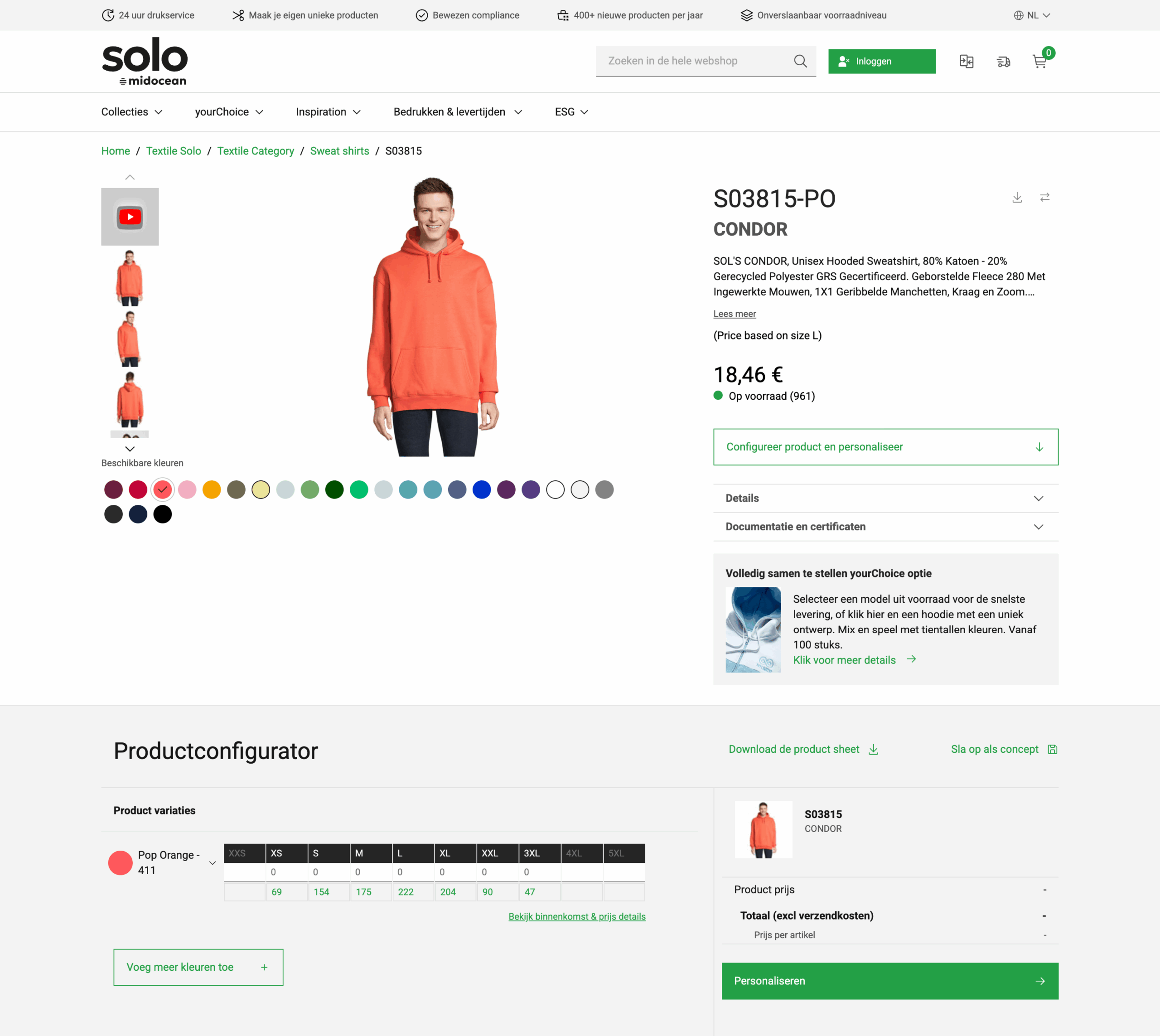
The main reason for this project was that Midocean wanted a modern, cleaner look for their product configurator on the Product Detail Page. The old design felt outdated and didn’t match their goal of a smoother, more user-friendly experience.
As we worked on it and tested with users, we noticed a few things: the “Calculate my price” button confused customers who just wanted plain products, B2B clients needed clearer price breakdowns, delivery info was too generic, and stock numbers could be tricky to read when large.
These small but important insights showed that the redesign wasn’t just about looking nicer, it was about making the page easier to use and understand.
Stakeholder Alignment
Once we knew a redesign was needed, a big part of the process was syncing with different stakeholders at Midocean. The PDP touches many areas of the business, from sales to operations, so everyone had slightly different priorities.
This meant a lot of back-and-forth: discussing priorities, reviewing early concepts, and tweaking details based on feedback. It could be challenging at times, but working closely with everyone helped refine the direction step by step.
In the end, we landed on a solid first version of the new PDP design, ready for user testing.
Working towards the MVP
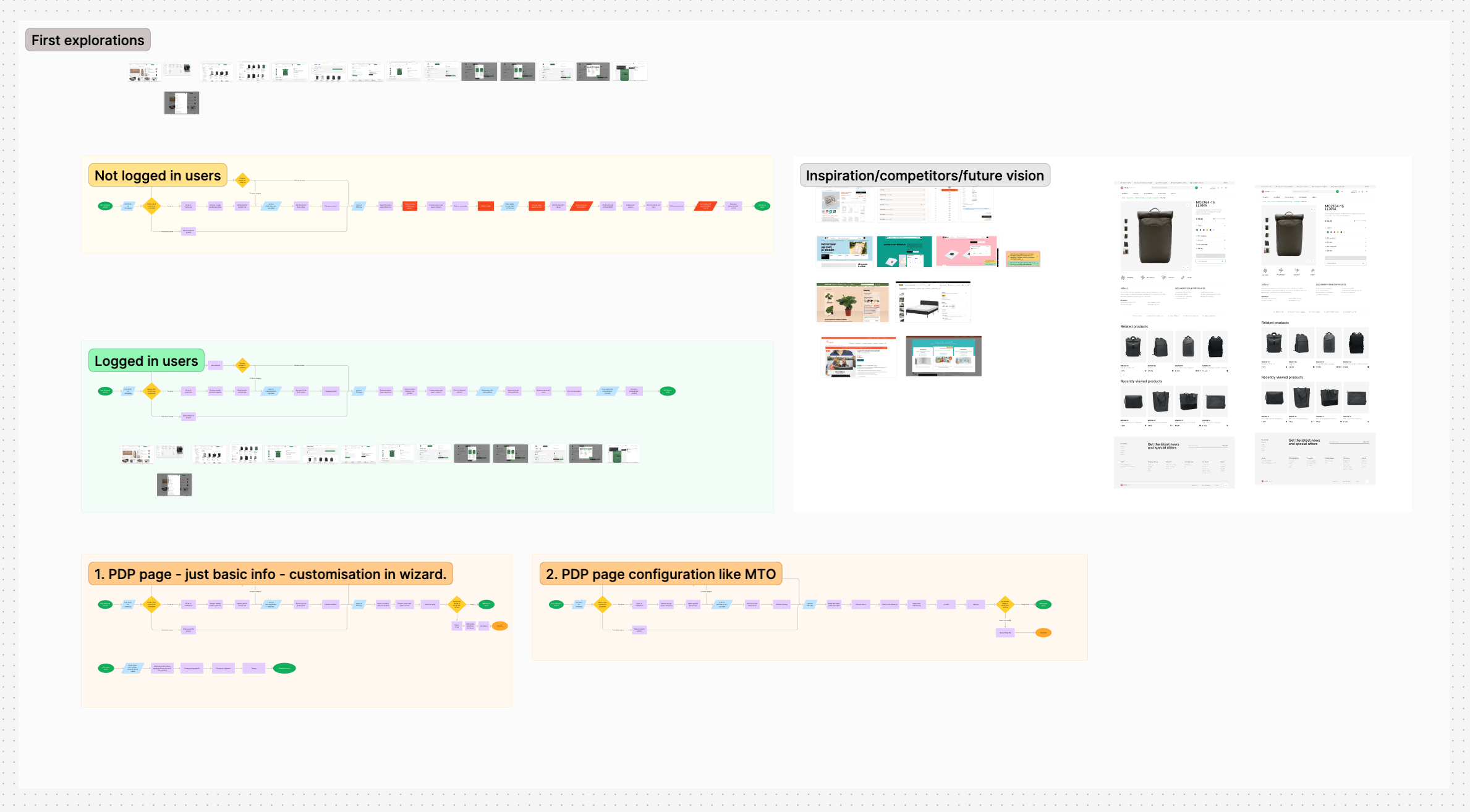
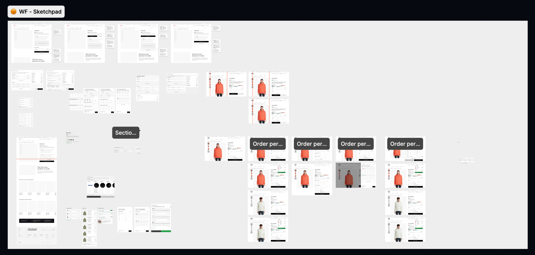
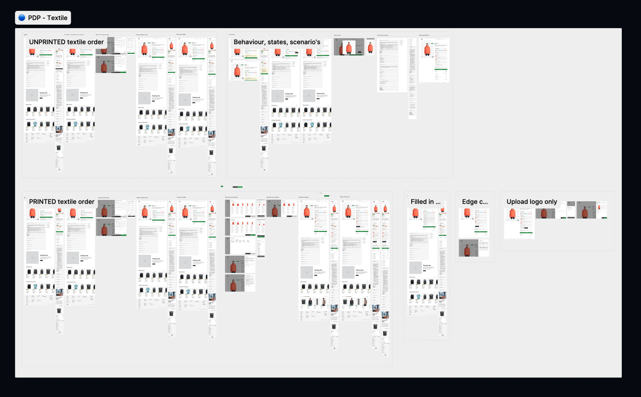
After aligning with stakeholders, the next step was turning that shared vision into something concrete: the MVP. I started with simple wireframes based on stakeholder input, focusing on main screens like product details, printing options, and delivery info.
I shared the drafts, got feedback, and iterated. For example, we realized some users didn’t understand “Calculate my price” for unprinted products, so I refined the wording, rearranged elements, and removed unnecessary steps.
I then created a few wireframe versions: one focused on clarity, another on speeding up the flow into the print configurator, and another on clearly showing all B2B pricing options. Each had trade-offs, but discussing them with stakeholders helped us pick the approach that brought the most value for users.
Once we chose a direction, I built a clickable prototype covering the core journey: viewing a product, checking stock and delivery, and starting print customization. The goal was to test the MVP properly without overbuilding.
By the end of this phase, we had a validated prototype with all essential screens and flows, ready for user testing with real Midocean users.

Iteration & User Testing
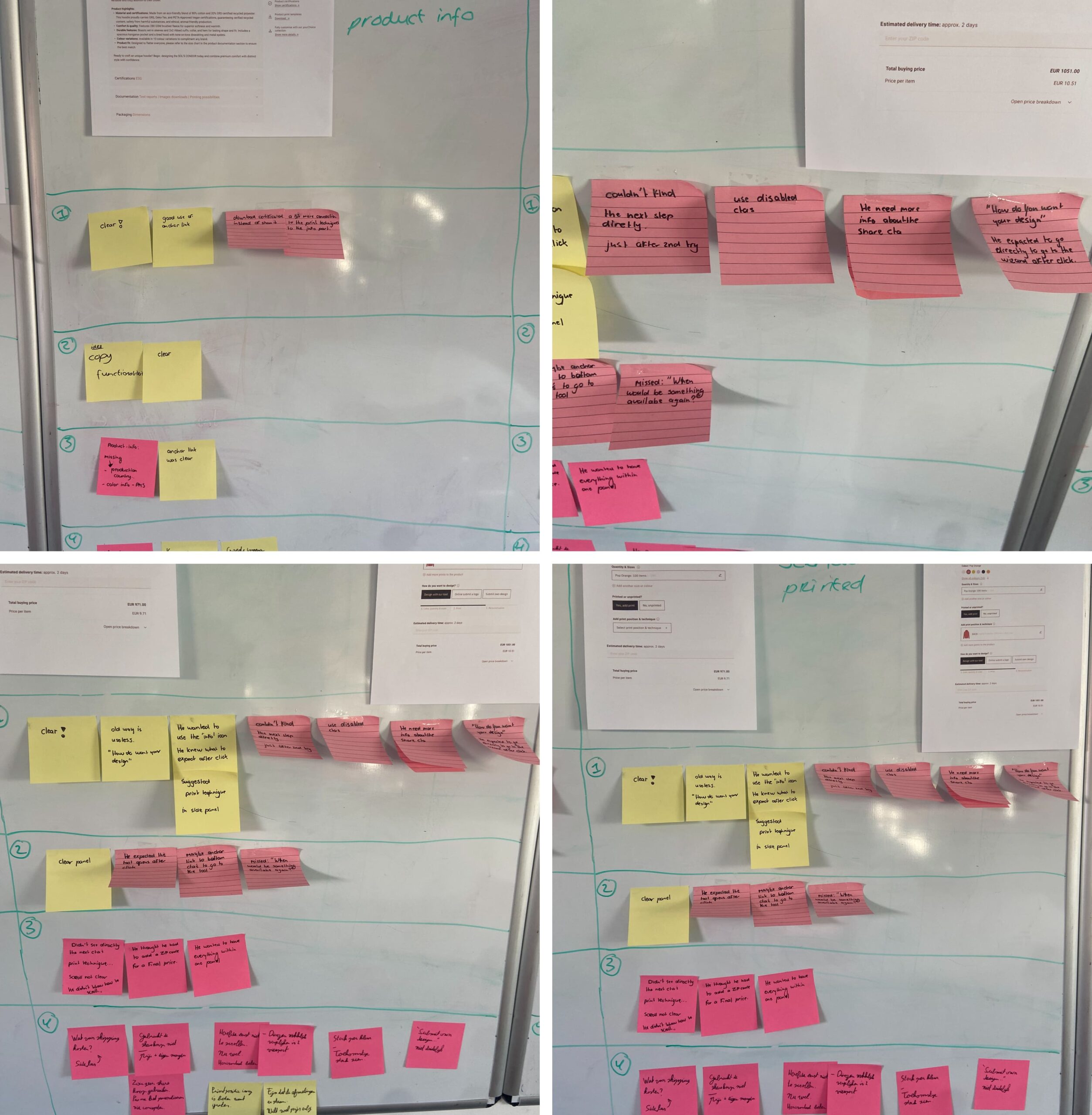
After delivering the first version of the redesigned PDP, we moved into an iterative phase. I tested the new design with five Midocean users. Overall, the feedback was positive: the page looked cleaner, more modern, and easier to read. But the sessions also highlighted areas for improvement.
Users wanted stock info to be visible immediately by colour and size, including future availability. They also expected key details, like size charts, delivery times, and packaging, to be accessible without extra clicks. On pricing, quick-reference tables for bulk quantities and region-specific shipping estimates were essential for B2B clients.
In the print configurator, the logic was clear, but the flow felt slow. Users preferred fewer steps, a direct link into the design tool, and a horizontal layout for selecting print positions. The “Save & share” feature was rarely used in its current form and needed rethinking to match reseller workflows.
These insights helped us refine the PDP beyond its new look, making it faster, more intuitive, and better aligned with the day-to-day needs of Midocean’s customers.
The outcome
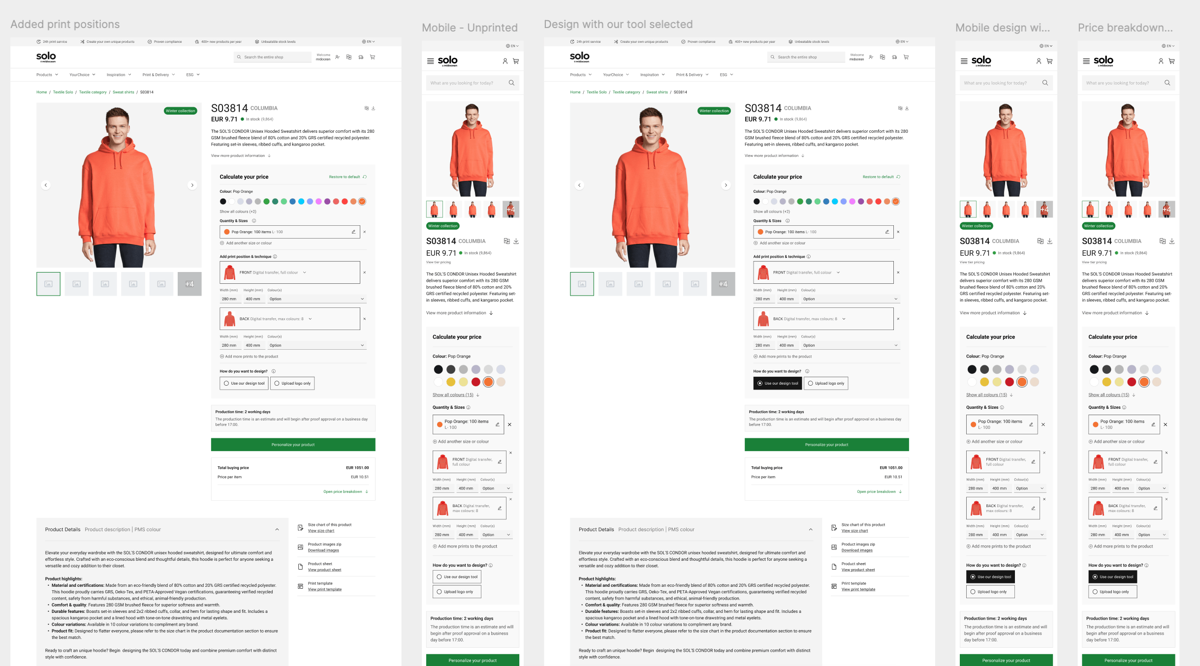
The redesigned Product Detail Page delivered more than just a visual refresh. The new PDP now looks cleaner and more modern, while offering a smoother experience for both printed and unprinted product orders.
Key product info is easy to find: stock by colour and size, size charts, delivery times, and packaging details are all immediately accessible. The pricing section was reorganized to show clear buying prices, resale suggestions, and bulk tables, plus shipping estimates, especially useful for B2B and international clients.
The print configurator now has a more direct flow, letting users jump into the design tool faster and navigate more intuitively. Some features, like “Save & share,” still need tweaking, but the foundation is there for future improvements.
Overall, the new PDP feels modern, intuitive, and in line with Midocean’s brand. It combines a fresh look with practical improvements from user testing, making it easier for customers to configure, understand, and order products with confidence.
Let's grab a coffee, or two.
Looking for a collaboration or just want to get to know each other? Contact me below and let's schedule a (virtual) coffee meeting!