Decathlon Homepage Redesign
Opdrachtgever:
Decathlon Nederland
Type:
Re-design homepage
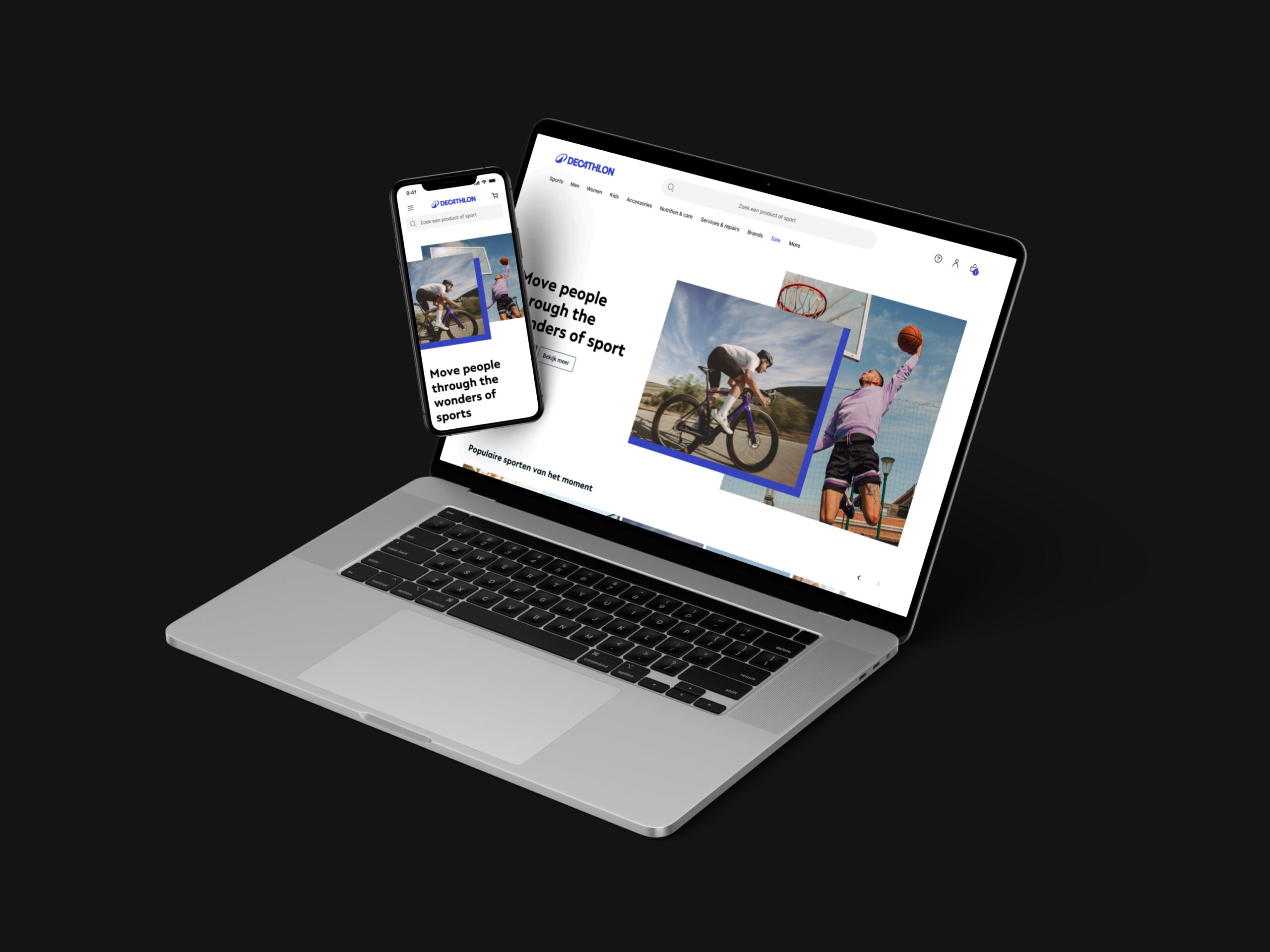
Welcome to the new Decathlon NL homepage! I’m excited to share the redesign I’ve been working on. As a UI designer, my focus was on making the experience clearer, more usable, and visually appealing.
This project reflects Decathlon’s refreshed look and shows how style and usability can come together. Take a look around and see how the interface aims to make online sports shopping easier and more enjoyable.
Note: This redesign is my proposal as a UI designer and hasn’t been confirmed for implementation yet. I’m sharing it to showcase my vision for the future of Decathlon NL’s homepage.
Current Homepage
Before starting the redesign, I took a close look at the current Decathlon NL homepage to see what could be improved. This helped me understand what users want, what isn’t working, and where we can make things better. Key findings included:
The homepage feels uninspiring and doesn’t engage users.
The content container is too narrow, limiting visibility and usability.
Decathlon’s styling feels outdated and doesn’t match modern design trends.
Inconsistencies across pages create a disjointed experience.
The layout feels blocky and could be more dynamic.
With these insights, I proposed a redesign that tackles these issues and aims to make browsing Decathlon NL smoother, more enjoyable, and visually appealing.

Research Phase
After the initial research, I explored online inspiration to gather ideas for redesigning Decathlon NL’s homepage. Browsing UI/UX platforms, industry trends, and competitor websites helped me see what works and spot innovative approaches.
By looking at successful e-commerce sites, studying emerging design patterns, and keeping up with new tech, I collected ideas and concepts to guide the next steps of the redesign.
This research allowed me to envision creative solutions that not only fix the current homepage issues but also improve the overall user experience and elevate Decathlon NL’s online presence.

Wireframing
During the lo-fi wireframing phase, I started with basic layouts directly on my laptop instead of sketching on paper. This digital approach let me quickly explore different ideas and functionalities. I focused on simplicity and usability, iterating fast to refine the design before moving to the mid-fi stage. The goal was always to find the best solution for users while keeping the interface clear and easy to navigate.

Mid-Fi Wireframing
For the mid-fi wireframing stage, I tried something a bit different. Instead of picking one lo-fi sketch to develop further, I expanded on all of them, creating multiple mid-fi versions for each concept. Why? To explore different ways of expressing the design and show off my UI skills.
By making several mid-fi wireframes per concept, I could experiment with layouts, features, and styles while refining each idea. This approach not only challenged me but also gave a clear view of my design process. Each mid-fi version was a step toward a user-friendly and visually appealing interface, bringing us closer to the final design.

UI design & Animating
Designing the UI and animations for the e-bike pages was a fun and exciting process. My focus as a UI designer was on creating an interface that’s both easy to use and visually appealing. I paid attention to every detail to ensure a smooth, seamless experience. By adding thoughtful design touches and subtle animations, I aimed to highlight the product and make browsing more engaging. This project reflects my passion for creating digital experiences that leave a lasting impression.
Let's grab a coffee, or two.
Looking for a collaboration or just want to get to know each other? Contact me below and let's schedule a (virtual) coffee meeting!